
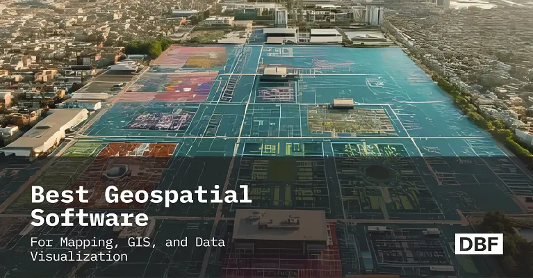
Best Geospatial Software for Mapping, GIS, and Data Visualization
Explore the best geospatial software tools for urban planners, architects, and GIS professionals in 2025. It highlights the growing importance of user-friendly platforms that combine spatial data, 3D modeling, and real-time analytics for smarter city design. From powerful tools like ArcGIS Pro and Google Earth Engine to beginner-friendly options like QGIS and Digital Blue Foam (DBF), each software offers unique strengths—from deep data analysis to interactive visualization. DBF stands out as a bridge between GIS and urban design, offering intuitive features for planning, stakeholder collaboration, and performance analysis. The guide helps readers choose the right tool for their needs. · June 5, 2025
Consider the role of an urban planner in 2030. Analyze the live 3D map of your city. Analyze where floods might happen, where the traffic congestion spots are, and areas with their respective air quality, all updated and layered on a 3D model of your city.
In minutes, you identify a potential floodplain, encourage green infrastructure solutions, and share an easy-to-use and understandable map with key stakeholders. Accessibility is a key feature of modern geospatial visualization tools, ensuring these platforms are user-friendly and inclusive for a wide range of users, regardless of their technical expertise or needs. This is not just imagination; this is exactly what today’s geospatial tools let us do to make smarter, greener choices for our cities.
Urban Planners, Architects, and GIS experts need easy-to-use mapping tools that reveal location-based information and fit smoothly into their design process. However, many professionals struggle with complex interfaces and in selecting of right platform.
This guide maps out the top geospatial software of 2025, so you can choose the right tool and see how Digital Blue Foam (DBF) acts as a beginner-friendly gateway into spatial design.
What Is Geospatial Software?
Geospatial software is also called GIS or mapping software. Which gathers, stores, analyzes, and displays data related to specific locations. These tools visually display geospatial data on maps, allowing users to interpret spatial relationships, patterns, and movement between multiple data points. It combines information like map points, satellite photos, zoning plans, and environmental measurements to convert raw coordinates into useful insights.
In the field of urban planning and architecture, it’s frequently used for:
- Identification of flood-prone areas to guide where to strengthen resilience investments
- Modeling the transportation network of the city for optimal route design.
- Visualizing the land use plans in 3D to evaluate building density and sunlight access.
- Monitoring changes in green spaces and water quality over months and years.
GIS platforms like ArcGIS Pro and QGIS provide powerful analytical tools. Think statistical mapping, raster-vector calculations, and networking modeling. In contrast to mapping SDKs like Mapbox, and visualization-first apps such as City Engine are built for collaborative storytelling, custom map styling, and quick prototypes.
Geospatial Data Collection: Foundations for Accurate Mapping
Accurate geospatial data collection is the cornerstone of effective mapping, spatial analysis, and geospatial data visualization. The process involves gathering precise location-based information from a variety of data sources, including satellite imagery, aerial imagery, GPS tracking, and mobile devices. These technologies enable organizations to capture complex geospatial data in real time, ensuring that maps and geospatial visualizations reflect the most current and reliable information.
Modern mapping applications and GIS software streamline the data collection process, allowing users to record, store, and manage vast amounts of geospatial data efficiently. Drones and mobile apps further enhance the ability to collect detailed data points from hard-to-reach or rapidly changing environments. The accuracy and quality of this data are critical for creating maps that support environmental monitoring, urban planning, and operational efficiency.
By investing in robust geospatial data collection methods, organizations can visualize geospatial data with greater precision, uncover valuable insights, and make data-driven decisions that optimize resources and improve outcomes. Whether monitoring environmental changes, planning new infrastructure, or analyzing urban growth, high-quality geospatial data forms the foundation for every successful geospatial project.
Geospatial Analysis Techniques: Unlocking Deeper Insights
Geospatial analysis techniques are essential for transforming raw geospatial data into actionable insights. By applying spatial analysis, data visualization, and advanced mapping methods, organizations can identify patterns, trends, and relationships within complex data sets. These techniques help visualize geospatial data in ways that reveal hidden connections and support smarter, data-driven decisions. Geospatial analysis tools have applications in urban planning, environmental monitoring, disaster response, and transportation logistics, making them indispensable across various industries.
Specialized GIS software empowers users to perform a wide range of geospatial analyses, from mapping location data and analyzing transportation networks to monitoring environmental changes using satellite and aerial imagery. Machine learning and data mining further enhance the ability to process large datasets, uncovering valuable insights that might otherwise go unnoticed.
Industries such as urban planning, environmental monitoring, and transportation rely on geospatial analysis to optimize operations, allocate resources efficiently, and respond to emerging challenges. By leveraging geospatial visualization and interactive mapping applications, users can explore data points, identify trends, and communicate findings clearly to stakeholders. Ultimately, effective geospatial analysis unlocks the full potential of location data, driving business success and supporting informed decision-making.
Top Geospatial Software Tools to Explore in 2025
In 2025, geospatial software and tools will be more powerful and user-friendly than ever before in the history of mapping. They guide from city planner to architect and from data analyst to policy maker to make smart decisions.
Many leading geospatial visualization tools are compatible with both Windows and Linux operating systems, making them accessible to a broad range of users. These tools are used by professionals around the world, supporting global geospatial analysis and mapping needs.
Below, find some of the top tools to explore this year, and their pros and cons, main features, and how they’re commonly used.
ArcGIS Pro (Esri) – GIS Software
ArcGIS Pro by Esri is a top choice of professionals nowadays for mapping and analysis. It helps users in creating detailed 2D, 3D maps over time in 4D. City planners, urban designers, and environmentalists use to run advanced analyses, test various scenarios, and share their work and results on every possible medium. The strength of this tool can deal with large files, desktop, or web.
It works with satellite imagery, map layers, and design files from tools like AutoCAD and Revit. ArcGIS Pro is packed with features and is great for large-scale projects. In the meantime, it is very hard to learn and might be too advanced as well for the basic level map-making tasks.
Google Earth Engine – Satellite Data & Analysis
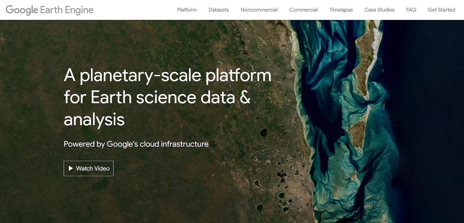
Google Earth Engine is an online tool that helps you work with large amounts of map and satellite imagery data. It has huge metadata of satellite images and advanced tools to analyze them. To predict the land use changes and growth patterns of the city, urban planners use this tool.
The core advantage of this tool can deal with complex files quickly because it runs on Google’s cloud. It is free for learning and research purposes, but businesses may need to pay for it. Some coding is required to perform complex and better analysis.
Mapbox – Custom Interactive Maps
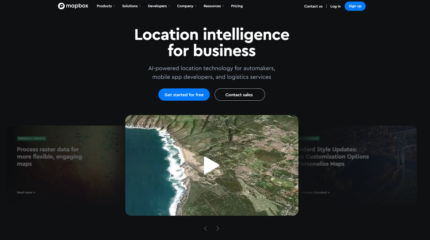
Mapbox is a tool that lets professionals create custom maps for websites and mobile apps. It is great for visualizing complex information by providing you flexible map designs, live data layers and 3D views.
Developers and planners can change the colors of the map, labels, and icons, and real-time data like traffic flow or sensor updates. It also performs efficiently on phones and tablets. But it is not made for deep GIS analysis like some other tools.
Digital Blue Foam (DBF) – 3D Urban Design & Analytics
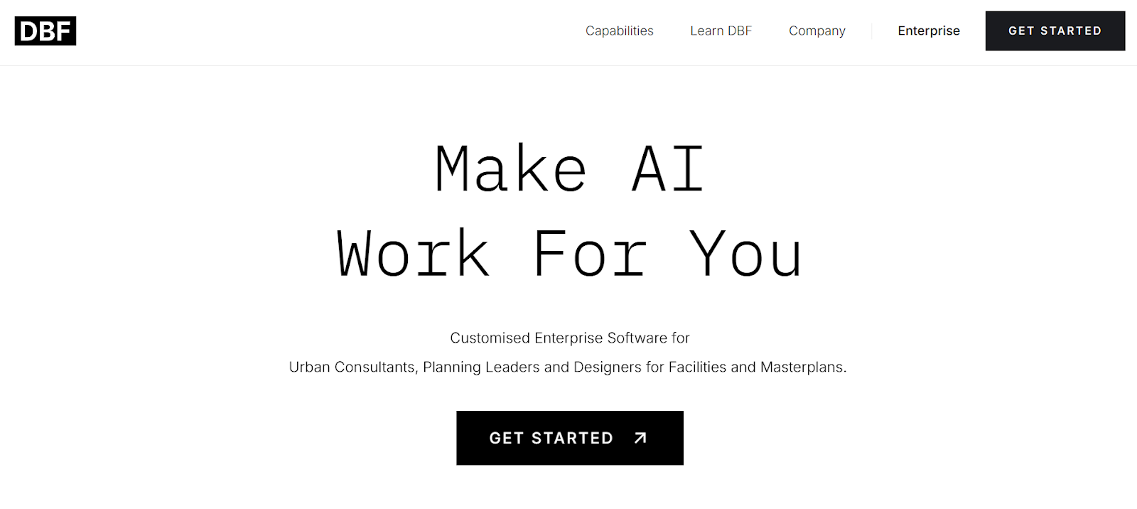
Digital Blue Foam (DBF) is a new and easy-to-use tool made for overall planning and design of buildings and cities that comes with smart spatial analysis features. It lets users create simple 3D models and can map data like noise level, zoning bylaws, on a prompt command.
Benefits of DBF’s Spatial Analytics:
- Design Validation & Optimization
Ensure your design performs at its best with Digital Blue Foam’s data-driven validation and optimization tools. Our platform empowers you to test, iterate, and fine-tune every aspect of your project, maximizing efficiency, sustainability, and overall impact before breaking ground.
- End-to-End Project Lifecycle Analytics
Make smarter decisions at every stage with analytics that span the entire project lifecycle—from concept to completion. Our solution delivers actionable insights that support informed planning, design, and development, reducing risk and enhancing outcomes.
- Inclusive Stakeholder Engagement
Streamline collaboration with a platform designed to involve everyone—architects, planners, developers, and community members. DBF ensures transparent, inclusive decision-making by integrating feedback from all stakeholders early and often.
- Location-Based Site Analysis
Leverage geospatial intelligence to assess development sites with pinpoint accuracy. Identify optimal design parameters, environmental factors, and zoning constraints that align with your goals—saving time and resources while increasing project feasibility.
A professional can identify the real-time impact of the sun and wind patterns on a site. Unlike GIS software, DBF is a custom software where the user has the option to get it made according to their needs.
Carto – Cloud-Native Location Intelligence
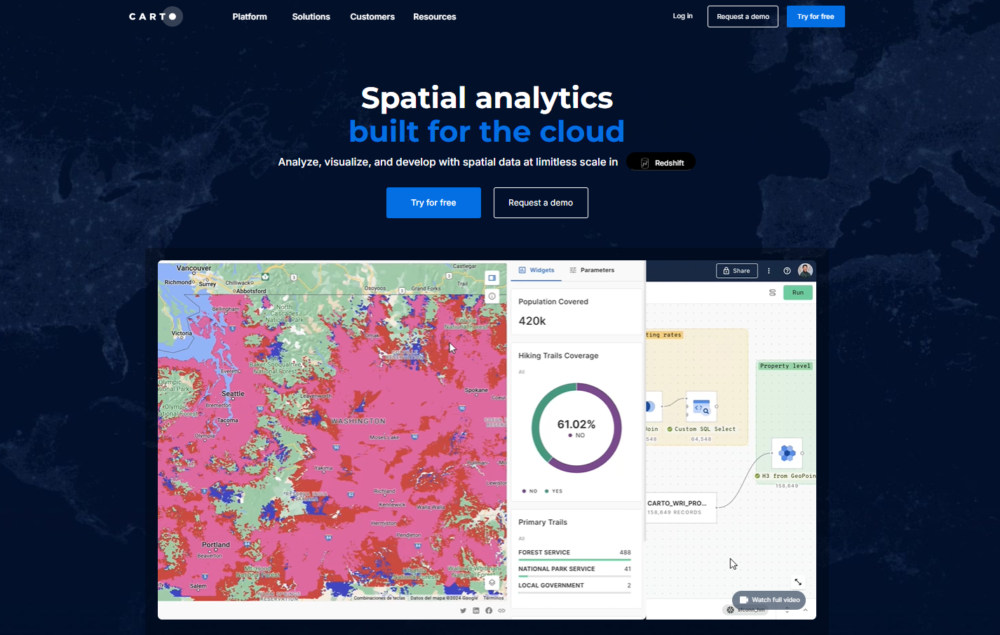
Carto is an online tool that assists businesses in analyzing and mapping large sets of location data. The plus of this tool is that it can connect with big data platforms like Snowflake and BigQuery and allow users to create maps and dashboards using simple drag and drop tools without integrating any advanced coding.
It is one of the best online tools for companies in real estate, retail, or telecom that want to find patterns, like which is the best area to open a store in the city. But it's mainly designed for data analysts, not for beginners or for people who just want to create simple maps.
Esri CityEngine – Urban Simulation
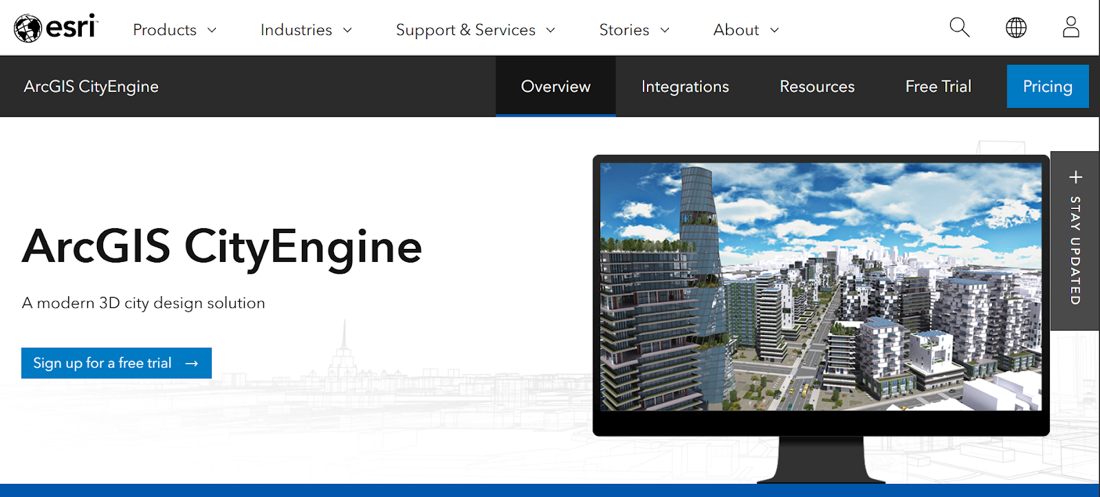
City Engine by Esri is a 3d design tool for creating realistic environments of city models. It uses GIS data, and urban planners can simply test various city layouts by adjusting things like building heights, zoning bylaws, and street patterns.
It can also allow the traffic flow to run the simulation. This urban simulation and other option-making tool is very useful for big city planning projects, but it is mainly designed for the user who has advanced 3d design features.
Open Source Community: Powering Innovation in Geospatial Tech
The open source community is a driving force behind innovation in geospatial technology. By fostering collaboration and knowledge sharing, the open source community accelerates the development of powerful GIS software and geospatial solutions. Tools like QGIS and GRASS GIS exemplify the flexibility and customization that open source platforms offer, enabling organizations to tailor their geospatial workflows to specific needs. GRASS GIS, in particular, is known for its advanced spatial analysis and modeling capabilities, making it a popular choice in both academic and commercial settings.
Open source GIS software provides a cost-effective alternative to proprietary solutions, making advanced geospatial technology accessible to a wider range of users. The open source community encourages interoperability and rapid development, allowing developers and organizations to build on existing technology and contribute new features. This collaborative environment not only reduces costs but also ensures that geospatial tech evolves quickly to meet the changing demands of users worldwide.
By embracing open source geospatial software, businesses and researchers can innovate faster, improve operational efficiency, and stay at the forefront of geospatial technology.
Data Visualization Best Practices for Geospatial Projects
Effective data visualization is crucial for communicating insights from complex geospatial data. In geospatial projects, best practices for data visualization include using clear and concise labeling, selecting color schemes that enhance readability, and ensuring that maps are properly scaled and projected. These elements help users quickly identify patterns, trends, and relationships within the data.
Interactive geospatial visualizations allow users to explore data in depth, analyze different variables, and gain a deeper understanding of the context. Incorporating interactivity—such as zooming, filtering, and layer toggling—enables users to focus on specific data points and extract meaningful insights. Consistency in design and attention to detail ensure that visualizations are both informative and visually appealing.
By following these best practices, organizations can transform complex geospatial data into accessible, actionable insights that drive informed decision-making and business success. Well-designed geospatial visualizations not only enhance understanding but also empower users to explore, analyze, and communicate data-driven findings with confidence.
How to Choose the Right Geospatial Tool
Selection of the right geospatial tool depends on what you need, what you're comfortable using, and your budget. Here are simple criteria to consider:
- Ease of Use: The tool interface should be beginner-friendly. Tools like QGIS or Digital Blue Foam are good for those who are just getting started.
- Data support: Make sure the tool has the integration option for AutoCAD, satellite imagery, and map layer files.
- Cost: Some of the tools are free, and some are not, like QGIS, while others need a paid subscription.
- Tool Compatibility: Does the software support the respective software, like BIM, Rhino, or Excel? If the integration is the concern, cloud tools like Carto or Earth Engine for big data set tools like ArcGIS are a good option, but a better fit for the office setting.
- Speed & Power: If the data is way too huge to work on, the cloud tools like Earth Engine or Carto are built to handle that.
The way geospatial data is visualized can significantly affect how results are interpreted and the conclusions that are drawn. Choosing the right visualization method is crucial to effectively communicate information. For example, a choropleth map is ideal for displaying population density across different regions, making it easier to identify spatial patterns and trends that might otherwise be missed with other map types. Choropleth maps fill geographic areas with different colors or shades to represent variables or values, providing a clear and intuitive way to analyze data.
Output: if the need is to show the results in realistic visualization instead of data maps, then tools like Mapbox or CityEngine are the best ones to go with.
How Digital Blue Foam Bridges Design and GIS
Digital Blue Foam (DBF) presents itself as an intuitive bridge between urban planning and spatial databases. It lets the users create ai driven 3d models while instantly showing helpful information on top:
Having the option to import building shapes and see relevant needed data like density, traffic flow, and zoning bylaws on the same screen.
DBF computes metrics (sun/shade patterns, viewsheds, noise exposure) as the model is adjusted, helping designers make informed choices early in the process.
Because DBF is cloud-based, teams can collaborate in real time. Changes to a model or data layer are updated immediately for all stakeholders.
DBF abstracts much of the GIS jargon. Planners still get valuable spatial insights without needing to master a full GIS software.
In essence, DBF acts as a gentle “gateway” to geospatial intelligence within design. Its focus on environmental and zoning context supports sustainable, code-compliant design from the very start.
Conclusion
Each tool offers different geospatial capabilities, for deep data analysis, traditional GIS tools ARCGIS Pro, are great. Web tools like Mapbox are best for creating interactive apps and maps.
For working on large data and tracking changes over time, Carto and Google Earth Engine work best. And tools like City-Engine and Mapbox Studio focus more on easy 3d design. And if just starting with the geospatial analyses, then beginners, beginner-friendly options like QGIS and DBF as well are a great place to start.
Ready to start geospatial design? Try Digital Blue Foam to bring spatial data into your next project!
FAQs
What is the best GIS software for beginners?
QGIS and Digital Blue Foam offer the gentlest learning curves, with drag-and-drop interfaces and minimal jargon.
What is the best AI for GIS?
Google Earth Engine leverages AI-driven algorithms for global-scale change detection; Carto’s spatial AI features help identify location patterns.
Is there free GIS software for planning?
Yes, QGIS is fully open-source, and Google Earth Engine is free for research use.
Can I visualize spatial data without coding?
Tools like DBF, Carto, and QGIS (with plugins) let you create maps and 3D scenes without writing code.
How is Digital Blue Foam different from traditional GIS?
DBF focuses on 3D design and visual simplicity, with on-the-fly analytics, whereas traditional GIS platforms provide deeper analytical toolsets and data management features.
