
Where do you live?
What could be an inspiration for this topic is, when I started looking around where I live right now - Boston, I can technically get to at least xxx grocery stores, xxx restaurants, xxx schools and universities, xxx parks, and even 1 hospital within 20 minutes. Micro improvement can make a huge elevation if we can bring this idea to our works.
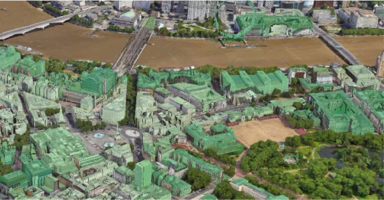
How does the environmental medium influence our lives? Along with the urban gentrification process that accelerates our lifestyles, shapes our behaviors as well as shortens the commute duration, people have more options on choosing where to live, where to work. Therefore, I didn't consider how influential these invisible datasets and information around us could be till starting the research in walkability scores and how to present these geospatial-related data to the public in a more intriguing and interactive way.
Isochrone map
A possible direction to explore is having data scattered in the map layer and sorting them in terms of different groups. Users are able to customize the zone they want to explore and get to know the data and information inside of it.
The factors we implemented here to measure the score for the neighborhood are 'Travel mode' and 'Duration'. Mayor Anne Hidalgo of Paris conceived the idea of a '15-minute city' which is a residential urban concept. Within an area of 15-minute walking or bicycling duration, residents can meet most of their needs, such as outdoor activities, daily supplies, basic facilities, neighborhood communities, etc. As long as we have the ability to analyze our neighborhood data and information, we can design a formula to calculate those factors and give a score. The higher the score, the better this neighborhood according to the isochrone area is.
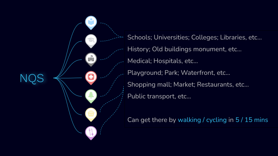
For the first version of our NQS, we consider measuring the 15-minute city, and there are 3 levels.
- 5 min walk shed: give access to ordinary needs;
- Small businesses ( convenient stores, shops, general commerce)
- One public square or main street with a cluster of shops ( cluster is more 5 or more shops)
- 15 min walk shed: give access to a full mix of uses:
- Grocery Stores ( at least 1)
- Pharmacy ( at least 1)
- General merchandise
- Public Schools ( at least 1)
- Larger Parks ( at least 1)
- Regional Train Station ( at least 1)
- 15 min Bike shed: give access to major facility for:
- Major Cultural Facility
- Major Medical Facility
- Higher Education Facility
- Regional Park
- Major employment center
- Inter-regional transit
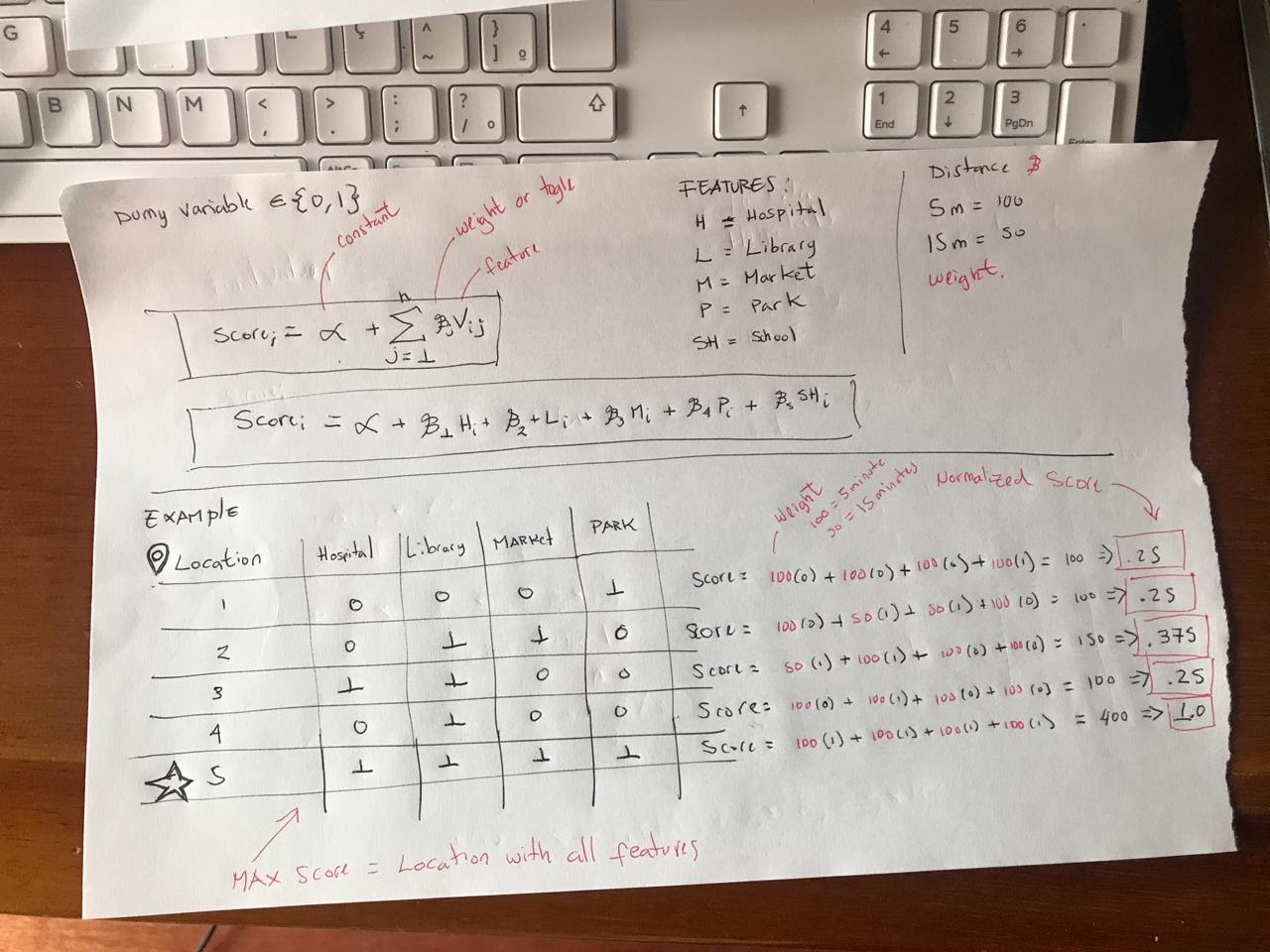
And all these can affect our computation for scoring the neighborhood score. The methodology we are exploring is adding any number of features and marking whether they are presented or not on the map and assign a weight to it, then we can normalize the result on a scale of 0 - 1 in terms of the highest score which is the one that has all features.
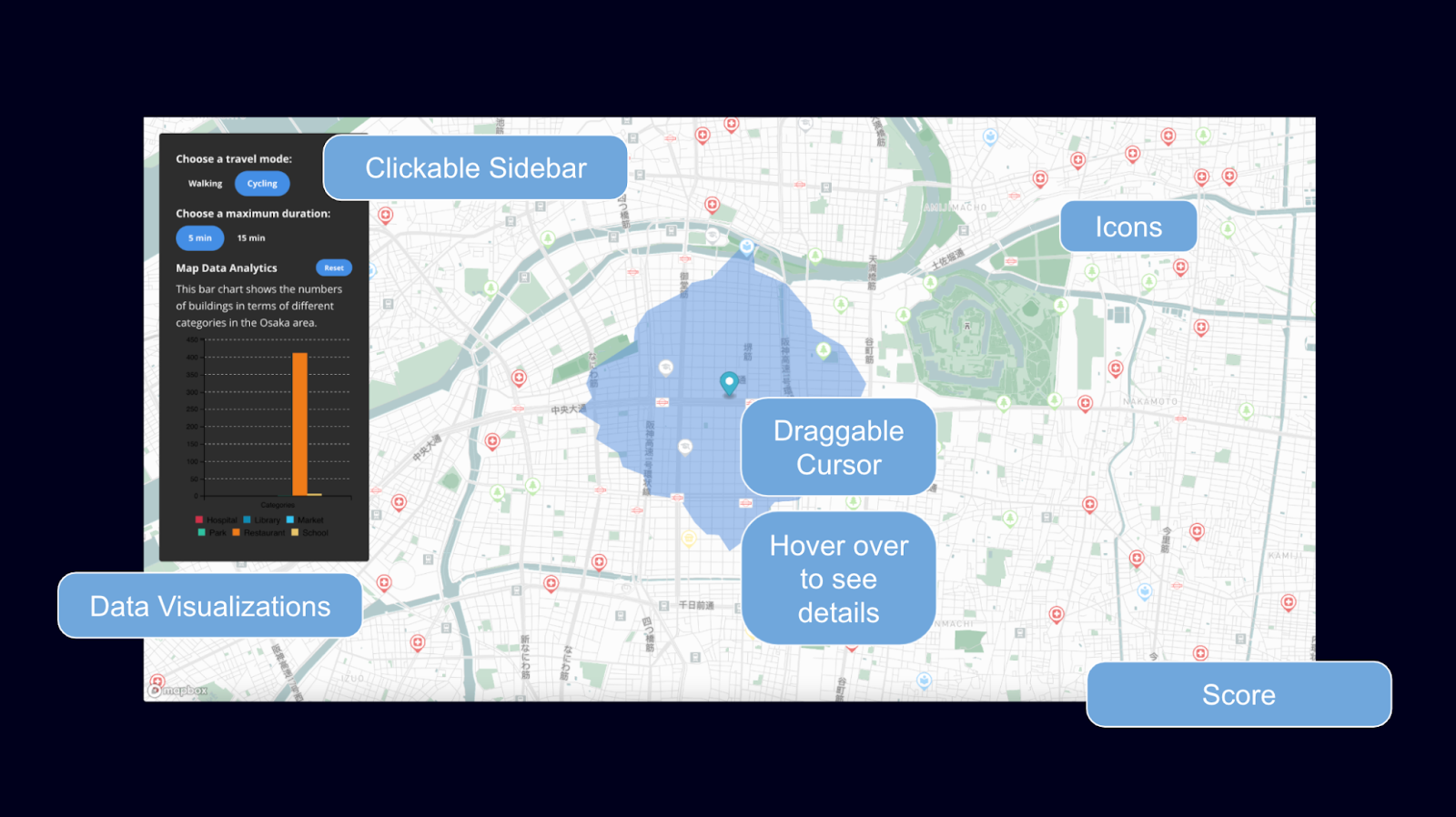
In view of creating the interactive and data-based map dashboard, first, we got the spatial data in a GeoJson format and implemented them in different map layers in QGIS and Mapbox. After applying the spatial datasets we have to the geographic graphic layer, we wanted to get the datasets only within the isochrone area. What we did was draw the polygon outline of the isochrone area and count every information dot within the selected line. As for the user interface design for this one-page map tool, we designed several individual control panels to let the users be able to customize the travel mode as well as the duration, and see both data visualizations and the neighborhood score in terms of the selected datasets.
The data visualizations based on selected area spatial datasets analysis were shown in the information panel in a few sections, which are 'Overview', 'Accessibility', 'Land Use Categories', 'Diversity Score', 'Building Area distribution', and 'Height'. As long as we figure out what information and datasets could be a solid reference, we can add them into our formula and make an impact on our neighborhood score computation. The current design system is dynamic for future improvements. We believe this NQS computation methodology will be super promising and help designers elevate our lives.
